spazz
-
Posts
21 -
Joined
-
Last visited
Content Type
Profiles
Forums
Gallery
Store
Downloads
Blogs
Events
Posts posted by spazz
-
-
Like most folks I have a collection made up of many different manufactures but my go to's are from Pro Acryl & AK gen 3. I was a very early adopter of Pro Acryl from when they were first introduced on the Creature Caster website & from following Jason's Twitch feed. They are really excellent paints. AK is a more recent purchase...well Gen 3 anyway as I used to buy P3 paints but they've become very hard to find in my area so I switched to Gen 3 and am really happy with them.
For metallics Metal Color for anything silver/steel and really just about any other manufacturer for other metals (Gen 3, Pro Acryl, Scale 75...etc)
-
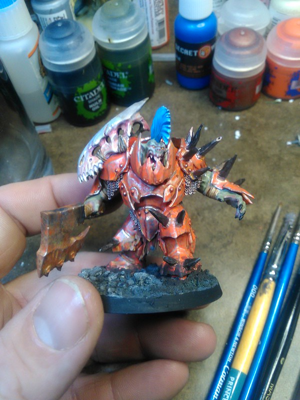
Bit of a older photo of my WIP on my Bog Dogz. I usually paint my Orks orange and thought these guy's had been banished to the swamps generations ago. The sun barely touches the inner depths where these guys start to loose their skin pigmentation & steel is a very scarce commodity so reserved for weapons only or for the very powerful so armour is mostly bronze.
-
 6
6
-
 2
2
-
-
I don't play competitively and stopped buying core sets at Beastgrave... maybe its because its 4:30 am where I am but this has confused me. Why does it matter when someone inspires? What has happened or been taken advantage of that brought this change about?
-
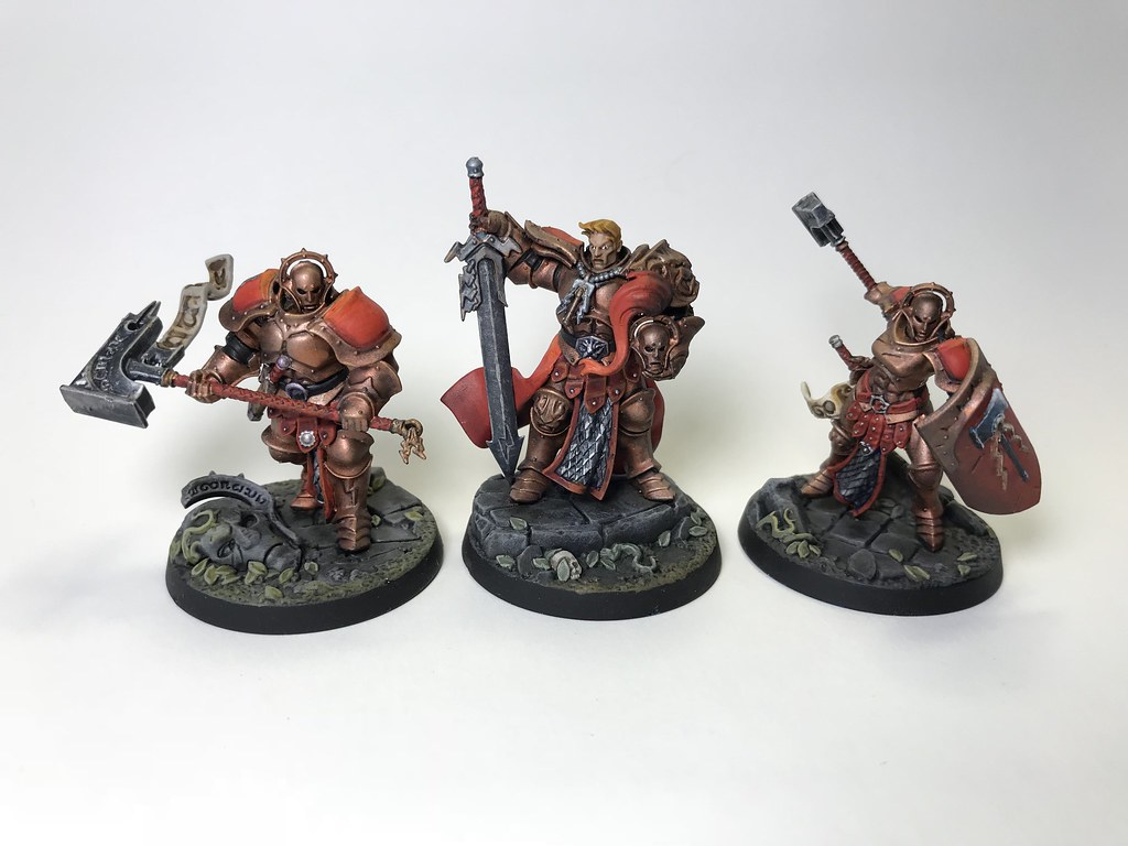
A few games in with these guys now and while I'm digging them on the whole there is something lacking & I can't put my finger on it. I don't play competitively so can't speak to them on that front, however they seem like a weaker Stormcast. There is no doubt I need to tweak my deck & likely need to adjust my play style but am hoping the new Ork warband brings me what I need!
-
I have a question that I couldn't find a answer to, can a player who's warband is taken out of action still play "environment" changing ploy's (like earthquake?) or does he need to have skin in the game to be able to do so?
-
On 8/2/2018 at 10:43 PM, Sleboda said:
Unless there is a clear text somewhere, I'm not so sure you get to count 1 defender of you have 0.
If the card reads "additional" then you have to start with one. You can't have an additional thing that you have none of to begin with.
None to one is not an additional one. It's just ... having one now.
Maybe I missed something in reading this through, but if it reads as this "This fighter is considered to have an additional supporting fighter when they are holding an objective" you are not starting with 0 as the one fighter is holding an objective so therefor you have 1 fighter in play you get to add a "second". I read it as I get a additional fighter in a supporting role.
-
Very true about art & true, not what I was going for but can easily see what you've said....I may run with that!?
-
-
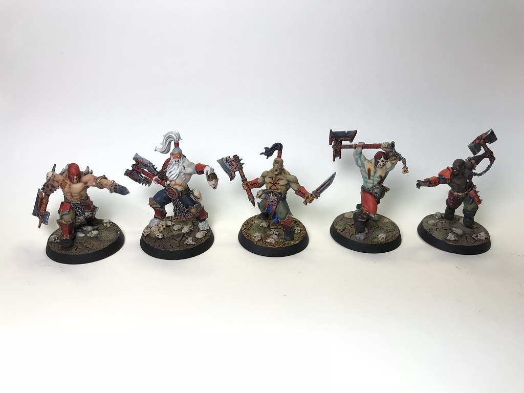
A little late to the party but had a busy last couple of days. It's a start on my Chosen Axes & part of this months painting contract

-
 3
3
-
-
2 hours ago, Okonomiyakimarine said:
Unsure how to do this, but I'd love to see more feedback in here. It is super motivating to see people react to a post and I enjoy the positive vibe here, but I just have to point my fingers on a few things that came to my mind looking through today's images. Hope this is alright and does not come across as rude or anything
@spazz: Good pose and great direction. What is going on with the skull? It looks like it is made of pearl or some liquid metal? If i'd do the model I would consider earthy tones for all things organic including the skull in a – hu – bone color, but this direction is unexpected and I think it is interesting and might end up crazy good! Just curious, where this is coming from and if it stays
 Really dig the weathering on the armour though!
Hey Okonomiyakimarine (dig the name man!) I'm not sure if you're familiar with Heavy Metal magazine or the movie spin off's, but one of my favourite artists is Richard Corben & his use of colour, kinda inspired by him with the skull.
-
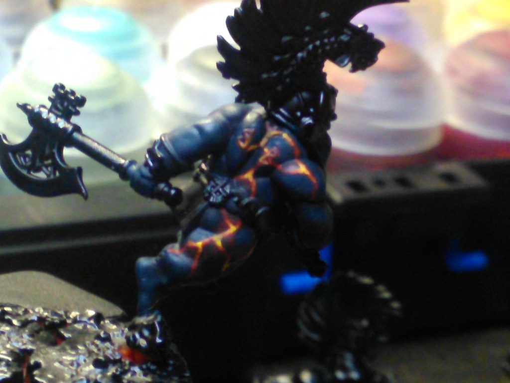
This mega boss is my swap in for Gurzag in my tribe for Shadespire, still have lots to do but am digging this model tons!

-
 8
8
-
-
Thanks for the advice gents (& ladies if present) !
-


Finally I have something to post although I'm rather ticked off about the finish. Fairly new to painting (less than a year) & starting to get the hang of wet blending only to have Purity Seal completely void the effect, oh well lesson learned. Does anyone have a good alternative for a matt sealer, hard to see but there is a "frosted" look
-
 4
4
-


Poll: Paint
in Age of Sigmar Discussions
Posted
I have a few of the new formula Vallejo's and yes they seem really quite nice. I usually gravitate towards Oranges & Teals/Turquois so when a newline is released I grab a few samples of these colours and giver a go. The old line of Army Painter has some of my favorite colours (Lava Orange..etc) and find it quite interesting the the old versions require far less shaking as they never seem to seperate all that much. whereas the newer line (prior to the relaunching ) need to shake the bejesus out of them and they don't match up to the old. Even their newest line can't colour match to the vibrancy of the old one, however the New Game Color line comes pretty damn close.
I'm with you on the Citadel & Reaper lines, enjoy quite a few but they do seem to be bottom tier nowadays. I do however enjoy the few Contrast paints I own & as for Scale 75, I've never really been on board with them. I have some....maybe 1st gen versions and that was enough to really put me off of them. They glaze terrible but layer like a dream so they have their uses. I do have a few newer ones and they seem to glaze better but the damage was already done.
I think it was Vince Venturella (sorry if I misspelled the last name) that had a nice recipe for a gold using Metal Color & Green Stuff World gold pigment if I'm not mistaken, haven't gotten around to trying that yet, but it looked aces!