


Superking
-
Posts
45 -
Joined
-
Last visited
Content Type
Profiles
Forums
Gallery
Store
Downloads
Blogs
Events
Posts posted by Superking
-
-
You got the lists?
-
Could Doomseekrs fight on death and damage boost on death make them a niche screen unit/small unit trader? Put them in front of a nasty and bait a charge or sit on a back objective. Wouldn't work against anything with ranged damage though.
-
Do you have the lists?
Also, had an idea to keep battlesmith alive. Given the rally is 18 inches, couldn't we use volcanos call to screen him?
-
Ok I'm gonna say it
Can we please stop Doko making non stop doom posts every 2nd post? It's the same stuff over and over and it's boring and adds nothing.
I guess I'll just repeat the same point 20 times too then -
Ok I'm gonna say it
Can we please stop Doko making non stop doom posts every 2nd post? It's the same stuff over and over and it's boring and adds nothing.-
 1
1
-
 1
1
-
 1
1
-
-
Double Axe zerkers seems like they'd at least be reasonable in Vostarg? Between hero buffs, ur-gold buffs, charge or counter attack, lodge buff, and fight on death it seems like they can put out some ok damage?
-
Ranking from 1-3 with 1 being the hardest, what is the most difficult mega to paint and what is the least? Why?
-
Got their lists?
-
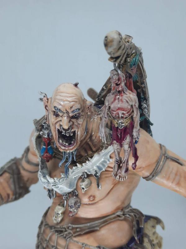
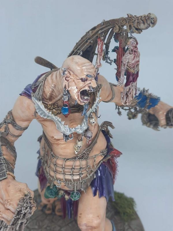
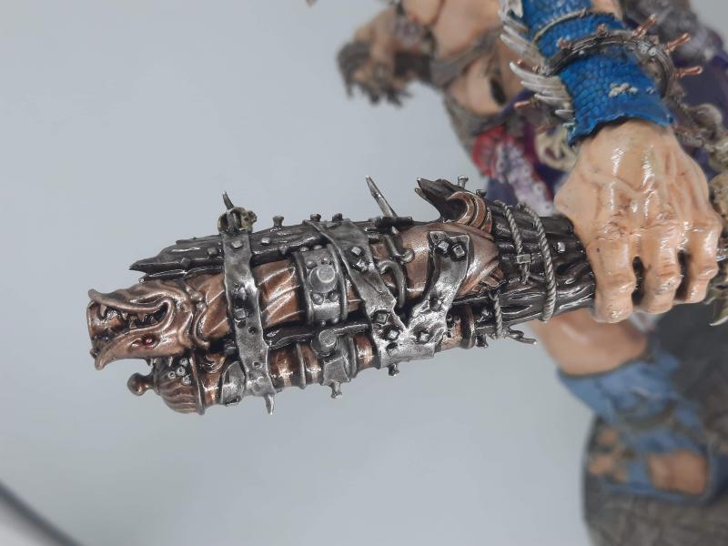
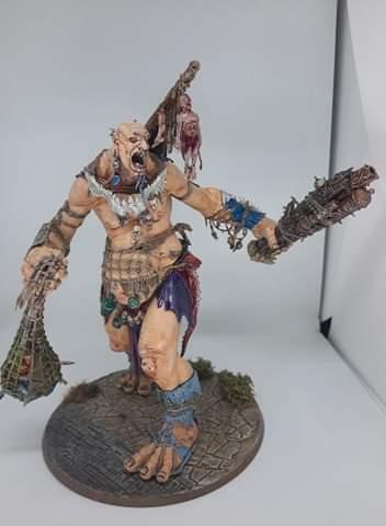
I've sealed the head with Matt cote. Somehow it turned out really glossy, so going over it isn't an option. Could I lighten the body skin with a very light skin wash?
-
Hello
I've had an issue with a giant I'm painting. The skin turned out differently on his head (painted months ago) vs body (this week).
I was following the gw guide.
Anyone got any ideas what I did wrong?
Added a couple of extra pics as also interested in general constructive criticism. Not happy with how he turned out.


-
In one of the previous posts someone mentioned sons lists are going defensive.
I wanted to see these and couldn't find them. -
Could anyone direct to sons of behemat tournament lists? Tried to find some but couldnt.
-
You can reach most of the detail even when it's glued in. The tongue is a bit harder admittedly but I think it's easier to paint it with jaws in.


-
1
-
-
You missed out the best bit! Glowy Lantern now grants wizard keyword.
This means that we can take endless spells I think? What would be the best spell? Emerald Lifeswarm?-
2
-
-
Hey guys I'd like to check with people who built the kraken eater - is there supposed to be a gap in the net? Seems like I have it in the right position but the gap seems a bit odd. (Note I still need to glaze the bottom of the net green)

-
1
-
-
Messing around with a base for my giants - it's supposed to be the giant going into a civilised area. Thoughts?

-
3
-
-
Hi, I am looking to buy the sons of behemat coasters. I am willing to pay £10 plus postage.
-
What's the hwg show?,
-
Cheapest place to buy them in UK?,
-
On 2/6/2020 at 7:13 PM, Nos said:
First point: I know you dont want to hear this but your things look cool and a hobby should be fun, so dont beat yourself up. If you're keen to improve because that's an ambition of yours and it excites you, fantastic that will be a rewarding venture.
But dont apologise for your stuff or feel as though it's not good enough. If it's not good enough for you focus on the fact you want to improve and that to do that you have to build on something and practice, but dont look at your inadequacies as you might perceive them as something awful that needs to be escaped. It's a journey. You're further on now than you were a year ago. Keep at it and you'll go further.
There is no other criteria. Literally no-one gets to tell you if you're stuff is good enough. It's yours.
Onto advice:
I would suggest you focus on contrast. This is by far the biggest thing that helped me.
If you look at your photos through a black and white filter (done this for you below) you will see there is not much dynamic range. The three guys at the back are too dark/smudgey, the guy at the front right is too bright.
Your eye looks for values at this scale to differentiate details , as the model is too small for the natural shadows and highlights created by natural light to be of much distinction. If you look at say a piece of furniture or clothing your eye can see shadows and shift in colour through how the light is filtered because those are big enough for your eye to distinguish. But a 28mm model is way too small for your eye to pick up on that and it's natural shadows are tiny. Accentuating Contrast is basically a way of tricking your eye into seeing those tiny values, or even creating them.
If you look at my Stormcast below you'll note that you can immediately see their outline, distinguishing features, details etc. You have no idea what colour they are but it dosent matter. You can see the models and their respective features clearly, and what different elements I wanted to draw attention to, heads in particular, are much more prominent than say belt buckles.
If you focus on creating a bigger difference between your darkest tones, mid tones and high tones, you will probably be much happier with your results and once you know how it works you can create far more dynamic results .
I recommend focussing more on those elements as you paint, rather than just assume a base, shade, highlight will give good contrast, as it often dosent. Think about what you're painting beforehand. People always look at weapons and faces first. It makes sense to invest heavily in these. If you put the same amount of effort into a belt buckle as you do a face in most issues you're just creating tension and reducing contrast. By definition you wont have any contrast if you paint the same everywhere.
With my SC below I spent a lot of time working through the tones of the armour but very little on anything else. You'll see the helmet plumes the Primes are holding is just one colour for example, didnt highlight at all. This was because I didnt want a bright beautiful headdress to detract from the main event which is their armour plate. There wouldn't have been anything *wrong* with highlighting it up bit I wanted to emphasise the uniform monolithic nature of the SC and bold individual details of leaders didnt serve this object for me. Alternatively though had I wanted to really broadcast the Primes as important individuals it would have made sense to go to town on their helmet decoration. The point is the colour is irrelevant, you can create tremendous feel and tone just through selective contrast.
One of the easiest ways to start improving contrast is just to focus loads on the Head, then a bit less on the torso and arms and weapon, less again on legs, then barely touch the feet. Just any figure you like, as a test. Or change it up and do the same but prioritise a shield, or torso or whatever. It might look a mess or weird but one bit at least will look really good and it absolutely will look more interesting than something which is flat and without volume. Once you get good at it you can split that idea into different smaller parts, so as well as focussing on painting the head, focus on creating contrast on it too. All my SC have a bright forehead and much less highlighting on their nose and raised parts etc as they are usually given, because I felt it made their faces more dramatic somehow.
And it really opens things up because its colour neutral. If you understand contrast you can paint something shades of entirely brown and have it look more vibrant and exciting than a miniature painted with dozens of tropical tones. It's also completely indifferent to technique, you dont need to learn anything, you can do it with layers, drybushing, sponging, blending, the application dosent matter, it's not about how you put the paint on, it's where you put it. If you learn how to do contrast well you can make drybushed stuff look more impressive than fine blends.
You can basically make any model look good with any colours if you understand how it works. By the same token, if you focus on the traditional stuff that tends to be based around application, if you're not putting your paint in whatever form it is in places that create interest, it really dosent matter. Models without good contrast however gorgeously and delicately painted will always look less dramatic than something with a good contrast value.


Sorry to necro the thread but I had to take a long break from the hobby and never got the chance to try these tips. Plan to give it a go over the next week and post results.
Is it possible to get a picture of the stormcast without a filter so I can compare that too?
Cheers. -
It was my first attempt at fire. The other dwarf heroes are more recent.
-
Hi guys. I really need someone to just be brutally honest and tell me what I can do to improve my painting. I improved from being a really ****** painted to "ok" over a few years and now I feel like I'm hardstuck at the painting level you see below, which I think could use a lot of improvement.
Please point out what I need to improve. I really can't figure it out. The hearthguard is the most recently painted but I had taken a break of 4-5 months.Thank you
Superking


-
6
-
-
I have some cool dwarf head masonry for my hearthguard berzerkers to stand on, but I thought about it and will this make them harder to hide since AOS uses true los? I.e if ones standing on a statue head, this could ****** me over if I'm trying to hide them?
I've not played much AOS yet so I don't really understand if this is something that is likely to come up. Should I care about this rule? -
So what are the benefits to running pure STD and in what situations would you do it?


AoS 3 - Fyreslayers Discussion
in Order
Posted
https://woehammer.com/2022/04/28/top-three-aos-lists-from-thr-annihilation/
Lofnir tournament win.